UI audit: shared buttons and clearer calls to action
02.04.2026
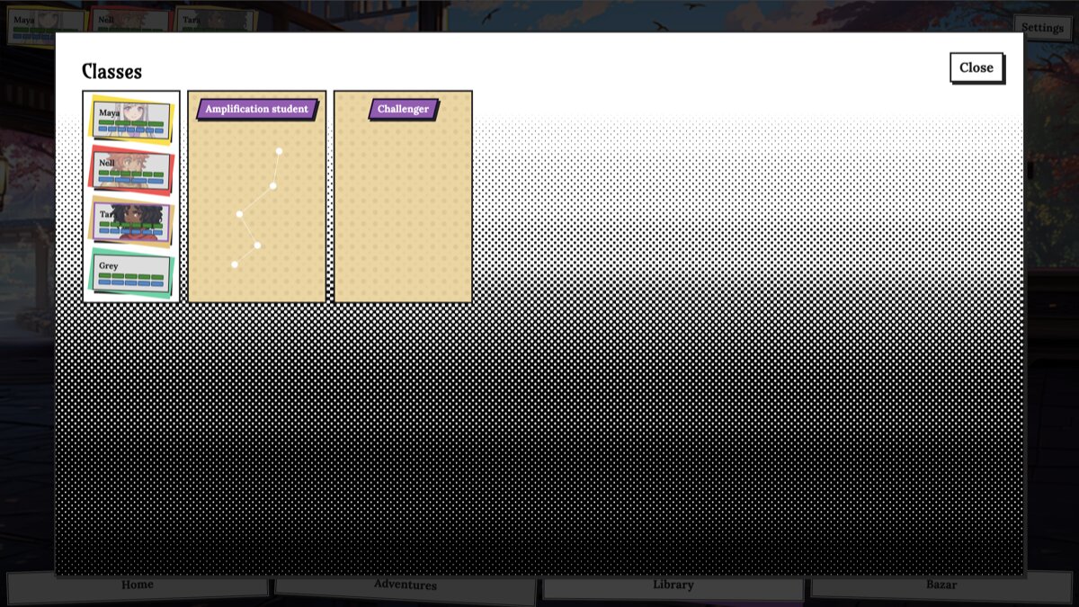
Playtests kept surfacing the same problem: people weren’t sure which control was the real next step versus a side option. Similar-looking chrome made important actions easy to miss.
We ran a full pass over buttons and labels across the app, then consolidated them onto shared building blocks. Styling, hierarchy, and wording now follow one system instead of one-off copies in each screen.
The goal is simple: when something is the call to action, it should look and read like one; when it isn’t, it should stay visually quieter. That should make menus, dialogues, and popups faster to scan.